Film-Inspired Wedding Color Palettes for 2026 and 2027 Weddings | Wedding Advice From a Pro
Film-Inspired Wedding Color Palettes for 2026 and 2027 Weddings
Looking for wedding inspiration for your 2026 or 2027 wedding? Here are the color palettes I’m loving for the upcoming wedding seasons.
Use the keywords section to help you identify elements you like (or don’t like) and pick one or two and then build your own unique set of keywords from there!
1. Golden Hour Garden
Colors: Butter yellow + cream + sage green
Why it photographs beautifully: This palette mimics late afternoon light filtering through leaves. The butter yellow adds warmth without competing with natural golden hour tones, while sage green grounds everything organically. Cream keeps it soft and breathable. On film, these colors blend seamlessly with outdoor settings and create that coveted sun-drenched look.
Where it works best: Wine country estates, garden ceremonies, coastal venues, outdoor receptions under café lights
Venue Ideas: Viansa, Beaulieu Gardens, V. Sattui, The Estate Yountville, The Outdoor Art Club, The Sea Ranch Lodge, Filoli, Nestldown
Key Words to Help you Search and Plan: Butter yellow, silk ribbons, dinner candles with votives or hurricanes, sage eucalyptus and olive branches, linen, organic florals, yellow cosmos and ranunculus and dahlias
The secret: Keep the butter yellow soft and buttery, not bright or highlighter-toned. This palette works because all three colors exist naturally in outdoor gardens - it's literally sunshine, leaves, and stone.
2. Coastal Twilight
Colors: Navy + cream + champagne
Why it photographs beautifully: Deep navy creates gorgeous contrast in natural light without the full contrast of black. Champagne and cream add luminosity that glows in candlelight. This palette photographs especially well during blue hour and creates elegant, timeless images that don't feel dated.
Where it works best: Seaside venues, historic mansions, candlelit ballrooms
Venue Ideas: The Sea Ranch Lodge, The Haven at Tomales, James Leary Flood Mansion, Kohl Mansion, Gallery 308 at Fort Mason, Edgewood Lake Tahoe, Cavallo Point
Key Words to Help you Search and Plan: Velvet ribbons, champagne, tapered candles, dark greenery, ivory silk gowns, modern elegance, calla lilies
The secret: Choose navy that reads almost black in low light but reveals richness in natural light. This palette works because it mirrors the actual colors of twilight - deep blue sky meeting pale horizon.
3. Sun-Faded Romance
Colors: Dusty rose + cream + champagne
Why it photographs beautifully: These tones mirror the softness of film photography itself. Dusty rose has enough depth to register beautifully on camera without going too pink or too brown. Combined with cream and champagne, it creates dimensional neutrals that feel romantic without being overly feminine.
Where it works best: coastal venues, Mediterranean-style venues, villa gardens, intimate chapels, wine country estates
Venue Ideas: The Sea Ranch Lodge, The Haven at Tomales, Paradise Ridge Winery, Viansa, San Ysidro Ranch, Holman Ranch, Montalvo Arts Center, Carneros Resort
Key Words to Help you Search and Plan: Dusty rose, silk napkins, pillar candles, quicksand roses, café au lait dahlias, blush veils, romantic elegance, muted tones, pink snapdragons and ranunculus, anemones
The secret: Dusty rose should be more mauve than pink - think antique roses, not fresh blooms. This palette works because everything lives in the same warm, muted tonal family with no jarring contrast.
4. Love in the Forest
Colors: Hunter green + brown + cream
Why it photographs beautifully: This palette is all about organic texture. Hunter green and brown mirror the natural world, which means they photograph with depth and richness in outdoor settings. Cream prevents it from feeling too heavy. These colors create grounded, earthy images with incredible tonal range on film.
Where it works best: Woodland ceremonies, refined barn venues, mountain lodges, forest settings, sleek architecture
Venue Ideas: Nestldown, The Estate Yountville, Cavallo Point, Ritz-Carlton Lake Tahoe, Santa Lucia Preserve, Stanly Ranch, The Conservatory at One Sansome
Key Words to Help you Search and Plan: Hunter green, velvet details, natural wood elements, beeswax candles, brown leather accents, unstructured greenery, earthy elegance, organic, linen, organic florals, candlelight
The secret: Use deep, forest-toned green rather than emerald or kelly green, and chocolate or walnut browns rather than orange-toned tan. This palette works because it's literally the color of moss, bark, and stone.
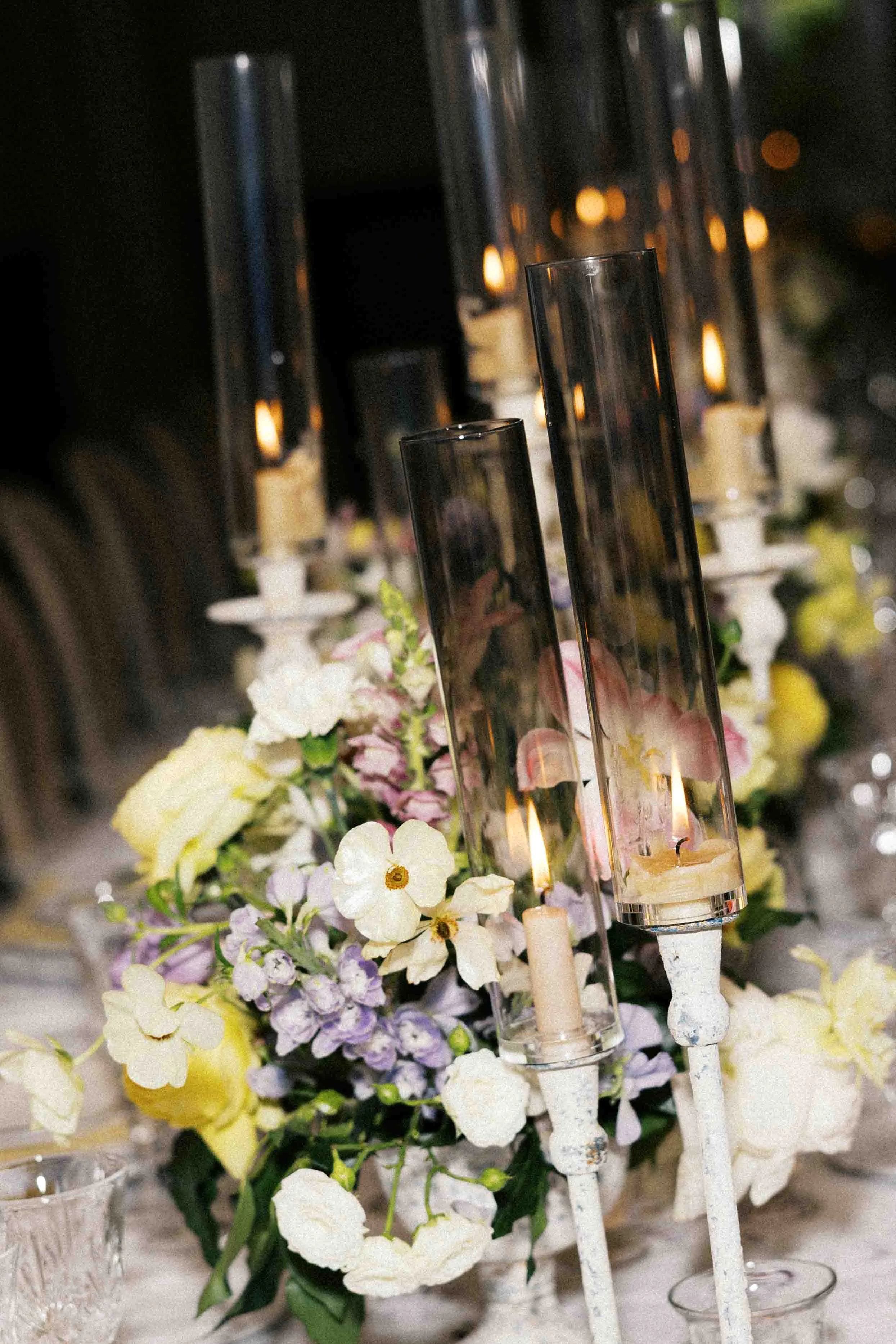
5. Mediterranean Afternoon
Colors: Lavender + butter yellow + cream
Why it photographs beautifully: Unexpected but magical—lavender and butter yellow create the warmth of a sunlit field without being literal. This palette has movement and lightness. The contrast photographs with clarity while still feeling soft. It's editorial without trying too hard.
Where it works best: Vineyards, outdoor pavilions, Provence, Mediterranean, and other European-inspired estates, garden venues
Venue Ideas: Paradise Ridge Winery, V. Sattui, Filoli, Brindare Napa Valley, Carmel Valley Ranch, San Ysidro Ranch, Outdoor Art Club, James Leary Flood Mansion
Key Words to Help you Search and Plan: Lavender napkins, butter yellow tapered candles, delphinium, scabiosa, flowing fabrics, French-inspired, English Tuder inspired, Beaux arts, garden romance
The secret: Keep the lavender silvery and soft, not bright purple, and the yellow warm and buttery, not neon. This palette works because both colors naturally appear together in Provençal lavender fields at golden hour.
6. Timeless Contrast
Colors: Black + white + cream + champagne
Why it photographs beautifully: Classic contrast never goes out of style, but adding cream and champagne softens the starkness. This palette creates striking, graphic images with depth.
Where it works best: Urban lofts, modern galleries, black-tie ballrooms, contemporary spaces
Venue Ideas: Gallery 308 at Fort Mason, SFCH Buyout, The Green Room, Palm Event Center in the Vineyard, Rosewood Sand Hill, The Conservatory at One Sansome
Key Words to Help you Search and Plan: Black dinner napkins, cream tapers, champagne chargers, white florals, anemones, ranunculus, Italian ruscus, modern elegance, black-tie
The secret: Use ivory and cream instead of stark white to keep it warm, and true black (not charcoal). This palette works because the warm neutrals prevent the black-and-white from feeling cold or corporate.
7. Sunset Canyon
Colors: Dusty rose + brown + champagne + cream
Why it photographs beautifully: This palette has incredible warmth and tonal complexity—every shade lives in the same light temperature family, which creates cohesive, film-like images. The browns add weight, dusty rose adds romance, and champagne/cream tie it together. It's sophisticated desert elegance.
Where it works best: coastal venues, Winery venues, Estates, outdoor ceremonies with warm-toned architecture
Venue Ideas: The Sea Ranch Lodge, Paradise Ridge Winery, V. Sattui, San Ysidro Ranch, Holman Ranch, Carmel Valley Ranch, Stonepine Estate, Mission Ranch Carmel, Montalvo Arts Center, Outdoor Art Club, Filoli, James Leary Flood Mansion, the Haven at Tomales
Key Words to Help you Search and Plan: Terracotta pots, brown leather details, dusty rose silk ribbons, champagne candles, mauve accents, desert romance, warm neutrals, candlelight, champagne towers
The secret: Every color should feel sun-kissed. This palette works because it mimics the exact colors of desert light at dusk: terra cotta earth, faded florals, and champagne sky.
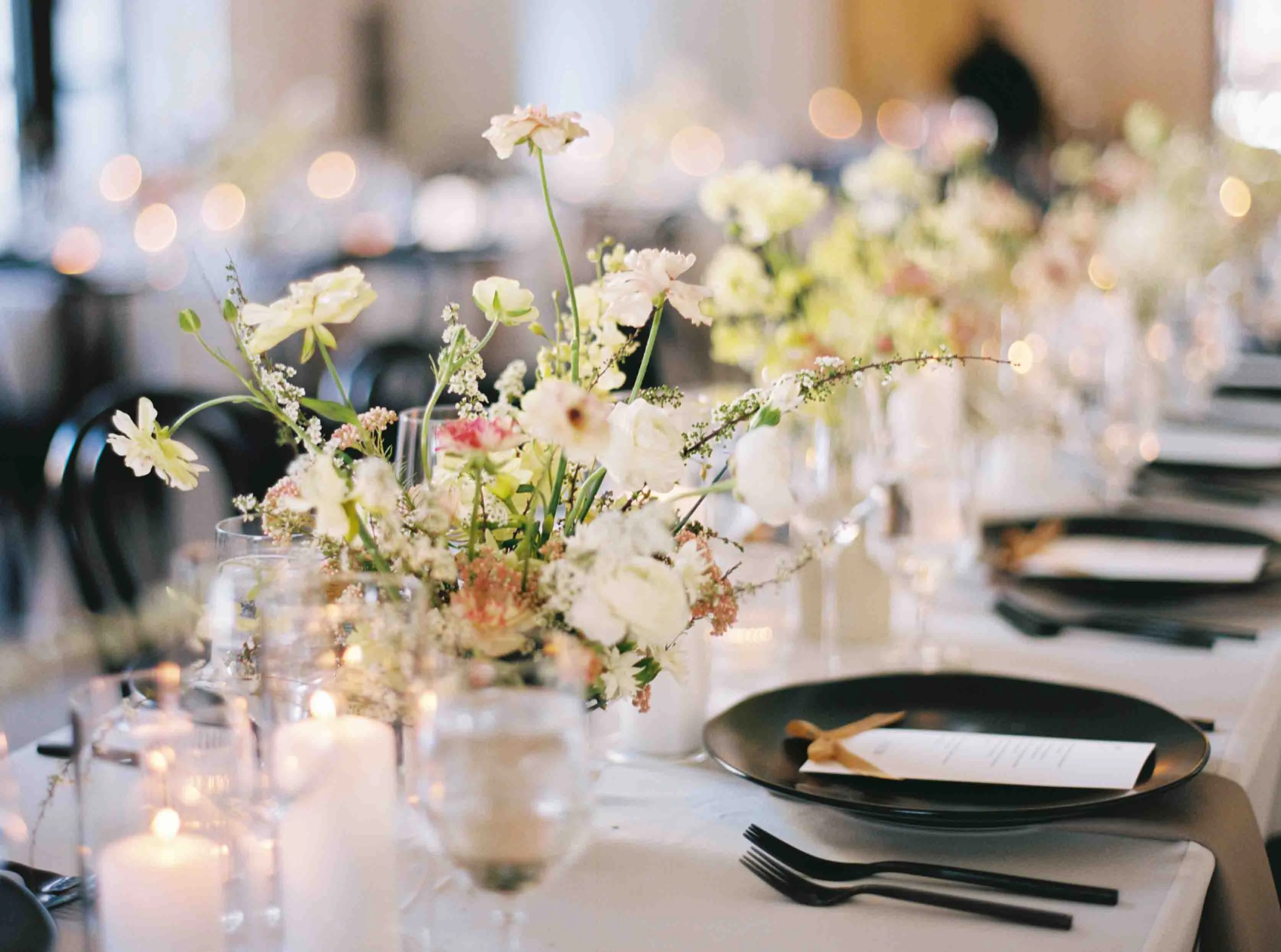
8. Editorial Orchard
Colors: Baby pink + cream + butter yellow + champagne
Why it photographs beautifully: This is the softest, most organic palette on the list. Everything here exists naturally in gardens and vineyards, which means it photographs with almost no effort. The lack of strong contrast creates dreamy, atmospheric images—especially beautiful on film stock.
Where it works best: Wineries, garden venues, estates, coastal venues
Venue Ideas: Beaulieu Gardens, V. Sattui, The Estate Yountville, Filoli, Montalvo Arts Center, Thomas Fogarty Winery, James Leary Flood Mansion, the Sea Ranch Lodge, Holman Ranch
Key Words to Help you Search and Plan: Sage silk napkins, butter yellow pillar candles, champagne ceramics, bay laurel, olive branches, mint, garden herbs, organic elegance
The secret: Keep everything muted and natural - no saturated colors. This palette works because pink, cream, and butter yellow are the exact tones of sunlight filtering through herb gardens and vineyard leaves.
9. Provençal Sunset
Colors: Soft lavender + burnt orange + cream + champagne
Why it photographs beautifully: This is one of the most unexpected yet stunning combinations for film photography. Soft lavender (think dried flowers, not bright purple) paired with burnt orange (terracotta-leaning, not neon) creates warmth and coolness in perfect balance. The contrast is vivid enough to be editorial but muted enough to feel timeless. On film, these colors glow - lavender reads almost silvery in certain light, while burnt orange deepens into rich amber. Adding cream and champagne prevents it from feeling too saturated.
Where it works best: Provence, Mediterranean, and other European-inspired estates, wineries, garden venues, coastal venues
Venue Ideas: Paradise Ridge Winery, Viansa, Brindare Napa Valley, San Ysidro Ranch, Carmel Valley Ranch, the Sea Ranch Lodge, Holman Ranch
Key Words to Help you Search and Plan: Burnt orange silk ribbons, soft lavender napkins, terracotta pots, lavender sprigs, peachy roses, purple scabiosa, silver brunia, rust velvet, sun-faded, Provençal
The secret: Keep the lavender dusty and the orange earthy - think sun-faded rather than saturated. This palette works because both colors exist naturally at sunset, when the sky shifts from amber to violet.
10. Modern Romance
Colors: Black + ivory white + deep burgundy red
Why it photographs beautifully: This palette is bold, graphic, and timeless all at once. Black creates drama and contrast that makes every other element pop. Deep red (think wine, not Valentine's) adds richness and emotion without being overly romantic. Ivory white (not stark white) softens the intensity and adds luminosity - especially beautiful in candlelight. This combination photographs with incredible clarity and depth on both film and digital. The contrast is strong enough to be striking but sophisticated enough to age beautifully.
Where it works best: Historic ballrooms, urban lofts, black-tie evening weddings, gallery spaces, candlelit chapels
Venue Ideas: James Leary Flood Mansion, SFCH Buyout, Legion of Honor, Kohl Mansion, Gallery 308 at Fort Mason, The Conservatory at One Sansome, Cavallo Point
Key Words to Help you Search and Plan: Black dinner napkins, ivory taper candles, burgundy, oxblood, wine-toned florals, garden roses, amaranthus, black velvet ribbons, magnolia leaves, smokebush, matte black flatware, old Hollywood, moody romance, candlelit
The secret: Choose burgundy or oxblood red rather than true red, and ivory rather than stark white. This palette works because it requires candlelight—black shadows, warm flames, and deep red create old Hollywood drama that photographs like a painting.

A Note on Choosing Your Palette:
The palettes that photograph most beautifully aren't necessarily the most colorful - they're the most intentional. When every element lives in the same tonal family or light temperature, your images feel cohesive without looking overly designed. Prioritize feeling & vision over perfection!